With the seemingly limitless amount of information that Google Ads provides, it’s easy for even the most seasoned pro to get overwhelmed. Luckily, making campaign decisions gets significantly easier once you know what data to analyze. Today we’ll go over how to create reports in Google Ads that can save you time and make managing your PPC campaign much easier. If you haven’t looked into the Google Ads Reports section yet, get ready to be wowed. To reach the Google Ads Reports section of your account, you can click on the bar graph icon next to the wrench and then click on ‘Reports‘. This brings up a blank template that you can drag and drop your rows and columns into. Now lets get into some reports you should be looking into every week:
Geographical Distribution
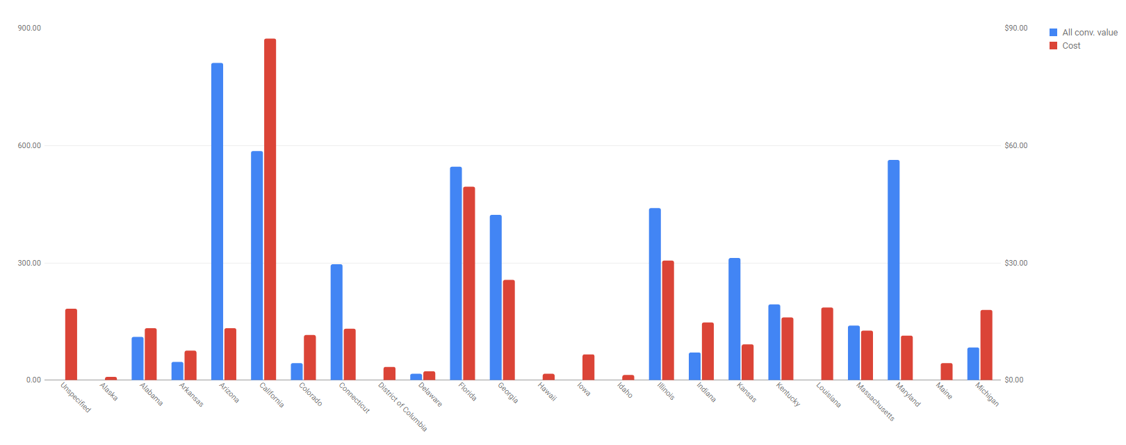
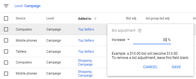
One report you should be looking at regularly is one that breaks your performance down into different regions. This allows you to use more of your budget on areas that produce a higher conversion value. To create this chart, drag ‘Region‘ into the row section and ‘All conv. value‘ and ‘Cost‘ as your values. This will produce a graph that breaks down your spend and conversion value by specific states or regions. Here you can see the areas of your campaigns that are performing the best, which gives you insight into areas you may want to increase bids. For example, this chart shows that a large percentage of the conversion value is coming from users in Arizona at a relatively low cost. In order to show your ad more frequently to users in this area, you’d want to adjust your location bids. To do this, you’ll need to log into you Google Ads account and go to ‘Location‘ on the left-hand navigation bar. Choose the location you want to show your ad more often in and click on ‘Bid adj.‘.
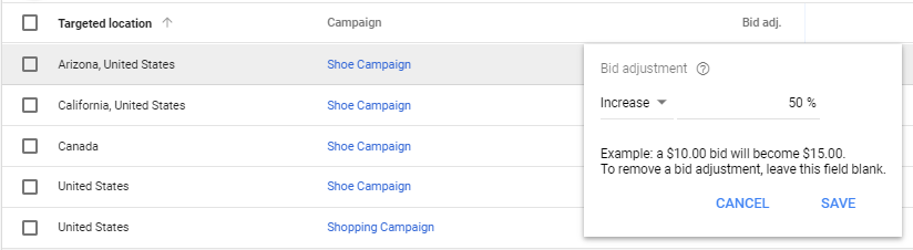
You’ll then be prompted to enter a percentage to increase your bid by. Just remember adjusting bids isn’t a set it and forget it kind of thing; after you make your adjustments, it’s always important to remember to regularly check the performance of your locations!
Device Distribution
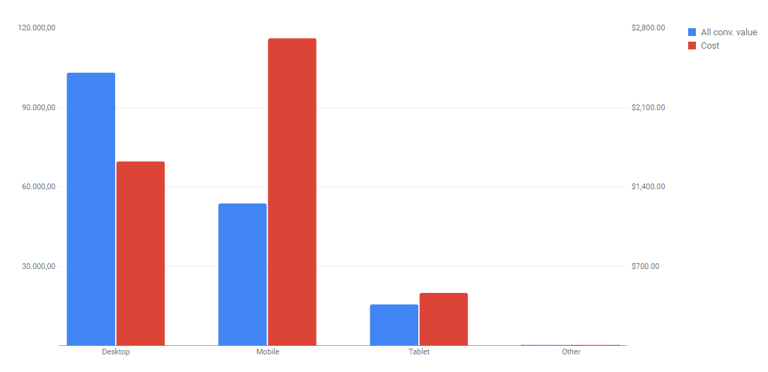
The next report breaks your account performance down by different devices. This is important to see how the majority of your consumers are making their purchases. To create this graph, drag ‘Device‘ into the row section and ‘All conv. value‘ and ‘Cost‘ as your values. While this overall view is helpful in giving you a good general idea on how your consumers make their purchases you’ll need to dive a little deeper to make better adjustment. One way to look into this further is to break this down even further to the campaign level.
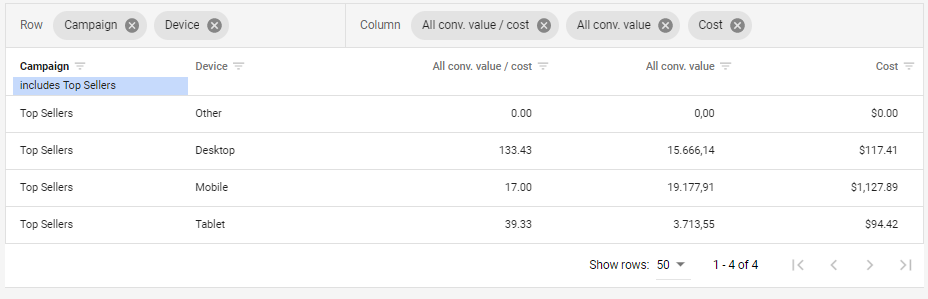
Here, I changed the report type to table and chose to analyze ‘All conv. value/cost‘, ‘All conv. value‘ and ‘Cost‘ for the ‘Top Sellers’ campaign. From this table you can see that this campaign is getting the biggest return on investment on desktop. This may be an indication to increase bids for this device so this campaign will be shown more frequently on desktop.
Hourly Performance
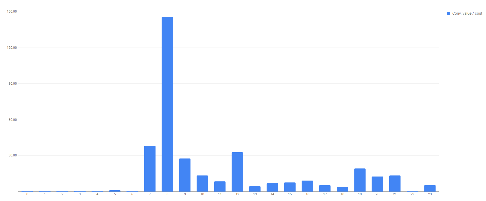
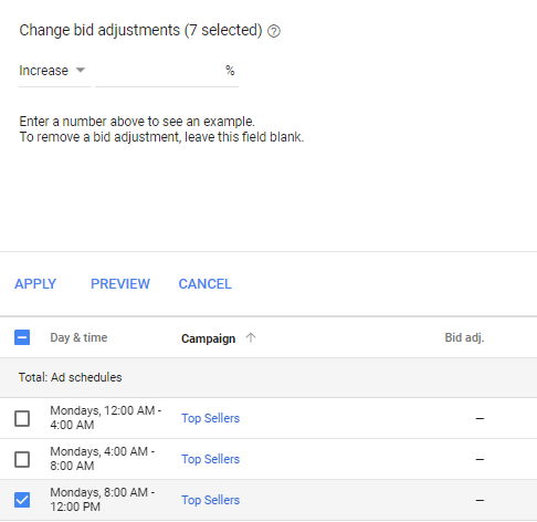
Similar to how the last report gave you more insights into how users make purchases, this next report will show trends in when they’re buying. In this report I looked into the ‘Conv. value/cost‘ or return on investment broken down by each hour of the day. In this example you can see that 8AM had the highest return on investment. To see an even more specific view, click on the filter icon (next to where you can change the reporting period) and filter the chart to show data from a specific campaign. If a trend continues over the course of a few weeks, you may want to consider adjusting your ad schedule so that your ads are shown more frequently during times with higher return on investment. To set this up, go to ‘Ad schedule‘ on the left-hand navigation and click the blue pencil icon. Choose which campaign you want to target and then begin adding different day-parts starting at midnight and spanning the entire day. Since Google Ads limits the amount of day parts to 6, you can segment the dayparts in 4-hour blocks.
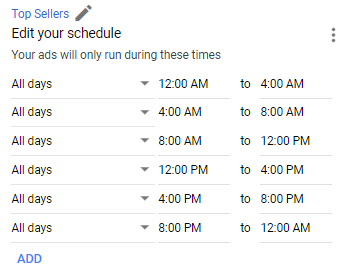
Once you create all your time blocks, hit save. Next select the day-parts that you want to increase (for this example, I’m going to increase bids for the 8AM-12PM blocks since that showed the highest return on investment overall. By doing this, the ads will still be shown throughout the whole day but they will be shown more frequently between 8AM and 12PM.
Impression Share
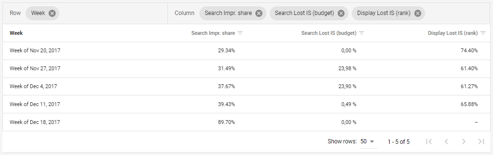
Finally, one last important report shows the breakdown of your impression share. To create this table, I segmented the following fields by week:
- Search Impr. Share – This is the percentage of times that your ads were shown out of the total times they were eligible to show.
- Search Lost IS (budget) – The search impression share lost to budget represents the times your ad was not shown due to a low budget
- Display Lost IS (rank) – The search impression share lost to rank represents the percentage of times your ad wasn’t displayed in the search results due to a low ad rank.
This is an important report to analyze because any lost impression share may indicate that you either need to increase your budget or look into ways to increase ad rank.
Now that you know which reports to look at, it’s time to get analyzing!